
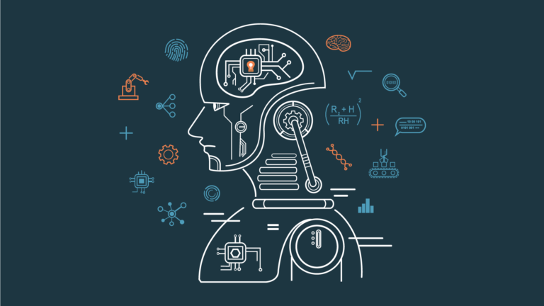
In a world driven by data, machine learning has emerged as a transformative force,...

In the rapidly evolving landscape of healthcare, the integration of machine learning technologies is...
In the fast-paced world of finance, where every decision can have profound implications, the...

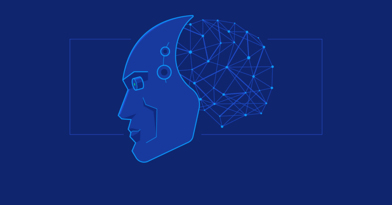
In an era defined by rapid technological advancements and the proliferation of data-driven decision-making,...
In the digital age, where every learner is unique and traditional one-size-fits-all approaches to...